Graphing a By-Group or Over-Time Summary Statistic
A common task in exploring or presenting data is looking at by-group summary statistics. This commonly takes the form of a graph where the group is along the x-axis and the summary statistic is on the y-axis. Often this group might be a time period so as to look at changes over time. Producing such a graph requires three things:
- A decision of what kind of graph will be produced (line graph, bar graph, scatterplot, etc.)
- The creation of the grouped summary statistic
- The creation of the graph itself
Keep in Mind
- Line graphs are only intended for use in cases where the x-axis variable (1) is ordinal (one value is “more” than another), and (2) takes consistently-sized jumps from one observation to the next. A time-based x-axis is a good candidate for use with line graphs. If your group is categorical and doesn’t follow a natural ordering, then do not use a line graph. Consider a bar graph or some other kind of graph instead.
- If you are making a graph for presentation rather than exploration, and your x-axis variable is categorical and doesn’t have a natural ordering, your graph will often be easier to read if the x-axis is sorted by the height of the y-axis. The way to do this will be demonstrated in the code examples below.
Also Consider
- This page will cover how to calculate the summary statistic in the graph code itself. However, an alternate approach that provides a bit more control and flexibility is to calculate the by-group summary statistic by collapsing the data set so there is only one observation per group in the data. Then, just make a regular graph of whatever kind you like, with the group along the x-axis, and the summary statistic on the y-axis. See Line Graphs or Bar Graphs.
- If you want a version of these graphs that has two groupings - one group along the x-axis and with different bars or lines for another group, see how to graph multiple lines on Line Graphs or multiple bars per x-axis point on Bar Graphs.
Implementations
R
# We want ggplot2 for graphing and dplyr for the storms data
library(tidyverse)
data(storms)
# First, a line graph with time on the x-axis
# This uses stat_summary
# Note that stat_summary_bin is also available,
# which first bins the x-axis, if desired
# Put the time variable in the x aesthetic, and the
# variable to be summarized in y
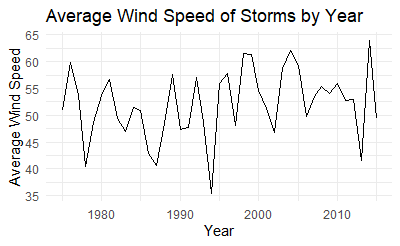
ggplot(storms, aes(x = year, y = wind)) +
stat_summary(geom = 'line', # Do we want a line graph? Point?
fun = mean) + # What function should be used to summarize?
# Note another good option for geom is 'pointrange', the default
# which you can get from just stat_summary(),
# which also shows the range of data
# Just decoration:
labs(x = 'Year', y = 'Average Wind Speed', title = 'Average Wind Speed of Storms by Year') +
theme_minimal()
# Second, a bar graph with a category on the x-axis
# Use reorder() to sort by which status has the most wind
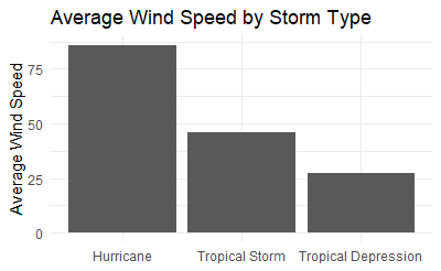
ggplot(storms, aes(x = reorder(status,-wind), y = wind)) +
stat_summary(geom = 'bar', # Do we want a line graph? Point?
fun = mean) +
# Decoration:
scale_x_discrete(labels = c('Hurricane','Tropical Storm','Tropical Depression')) + # make the labels more presentable
# Decoration:
labs(x = NULL, y = 'Average Wind Speed', title = 'Average Wind Speed by Storm Type') +
theme_minimal()
This code produces:
Stata
In Stata there is not a single graph command that will graph a summary statistic line graph for us (although there is for bar graphs). Instead, for line graphs, we must collapse the data set and graph the result. You could avoid collapsing by instead using bysort group: egen newvar = mean(oldvar) (or some egen function from help egen other than mean) to create by-group statistics in the original data, use egen tag = tag(group) to select only one observation per group, and then do the below graphing commands while adding if tag == 1 to them.
** Read in the data
import delimited "https://vincentarelbundock.github.io/Rdatasets/csv/dplyr/storms.csv", clear
* Keep the original data to return to after collapsing
preserve
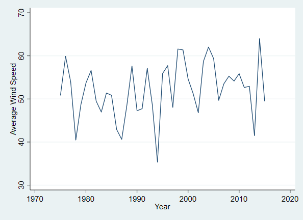
* First, a line graph with time on the x-axis and average wind on y
collapse (mean) wind, by(year)
* Then, a line graph
tw line wind year, xtitle("Year") ytitle("Average Wind Speed")
restore
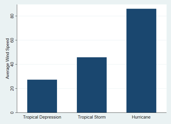
* Now, a bar graph with a category on the x-axis
graph bar (mean) wind, over(status, relabel(1 "Hurricane" 2 "Tropical Depression" 3 "Tropical Storm") /// Relabel the statuses to capitalize
sort((mean) wind)) /// Put in height order automatically
ytitle("Average Wind Speed")
This code produces: