Introduction
This is a brief tutorial on how to make bar graphs. It also provides a little information on how to stylize bar graphs to make them look better. There are a plethora of options to make a bar graph look like the visualization that you want it to. Lets dive in!
Implementations
Python
There are many plotting libraries in Python, including declarative (say what you want) and imperative (build what you want) options.
In the example below, we’ll explore several different options for plotting bar chart data. For even greater control over plot elements, users may want to explore the matplotlib library (and its bar chart functionality here), but the examples below will cover most use cases.
By far the quickest way to plot a bar chart is to use data analysis package pandas’ built-in bar chart option.
import pandas as pd

df = pd.read_csv("https://vincentarelbundock.github.io/Rdatasets/csv/DAAG/Manitoba.lakes.csv", index_col=0)

df.plot.bar(y='area', legend=False, title='Area of lakes in Manitoba');

This produces a functional, if not hugely attractive, plot. Calling the function without the y='area' keyword argument causes pandas to plot two columns for each lake based on the two variables in the dataframe, one for area and one for elevation (while sharing the same y-axis).
pandas uses the plotting library matplotlib under the hood. Many extra configuration options are available using matplotlib. In this case, let’s just tidy the plot up a bit by applying a style, adding in a label, and putting the title on the left.
import matplotlib.pyplot as plt

plt.style.use('seaborn')

ax = df.plot.bar(y='area', legend=False, ylabel='Area', rot=15)
ax.set_title('Area of lakes in Manitoba', loc='left');

For more sophisticated visualisations, let’s look first at the seaborn library. We’ll use the tips dataset.
Note that if seaborn finds more than one row per category for the bar chart, it will automatically create error bars based on the standard deviation of your data.
Although it is declarative, seaborn is built on matplotlib (like pandas built-in plots), so finer control of plots is available should it be needed. (Like df.plot.bar, sns.barplot returns an ax object when not used with the ; character.)
import seaborn as sns

tips = sns.load_dataset("tips")

sns.barplot(x="day", y="total_bill", hue="sex", data=tips);

Yet another declarative option comes from plotnine, which is a port of R’s ggplot and so has nearly identical syntax that library.
from plotnine import ggplot, geom_bar, aes, labs

(
    ggplot(tips)
    + geom_bar(aes(x='day'), colour='black', fill='blue')
    + labs(x = "Day", y = "Number", title = "Number of diners")
)

Other packages for bar charts include proplot, an imperative library for publication-quality charts that wraps matplotlib, and altair, a declarative library which produces high-quality, web-ready graphics.
R
For the R demonstration, we will be calling the tidyverse package.
library(tidyverse)
library(ggplot2)
This tutorial will use a dataset that already exists in R, so no need to load any new data into your environment. The dataset we will use is called starwars, which uses data collected from the Star Wars Universe. The tidyverse package uses ggplot2 to construct bar graphs. For our first example, let’s look at species’ appearences in Star Wars movies. Follow along below!
- First for our graph, we need write a line that calls
ggplot. However we just use ‘ggplot’ to do so. Note the+afterggplot(). This+ties the subsequent lines together to form the graph. A common error when making any type of graph inggplot()is to forget these+symbols at the end of a code line, so just remember to use them! - There are a couple of steps to construct a bar graph. First we need to specify the data we want to visulaize. We are making a bar graph, so we will use geom_bar. Since we want to use the
'starwars'dataset, we setdata = starwars. Remember the comma after this, otherwise an error will appear. - Next we want to tell
ggplotwhat we want to map. We use the mapping function to do this. We set mapping to the aesthetic function.(mapping = aes(x = species))Within theaesfunction we want to specify what we want ourxvalue to be, in this casespecies. Copy the code below to make your first bar graph!
starwars <- read.csv("https://github.com/LOST-STATS/LOST-STATS.github.io/raw/source/Presentation/Figures/Data/Bar_Graphs/star_wars_characters.csv")

 ggplot() +
    geom_bar(data = starwars, mapping = aes(x = species))

As you can see, there are some issues. We can’t tell what the individual species are on the x axis. We also might want to give our graph a title, maybe give it some color, etc. How do we do this? By adding additional functions to our graph!
ggplot(data = starwars) +
  geom_bar( mapping = aes(x = species), color = "black", fill = "blue") +
  labs(x = "Species", y = "Total", title = "Character Appearences in Movies by Species") +
  theme(axis.text.x = element_text(angle = 45, hjust = 1))
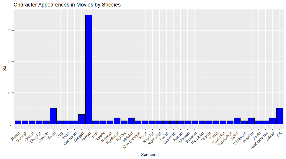
This graph looks much more interpretable to me, though appearences are subjective. Let’s look at what we did. First there are two additional parts to our mapping function, color and fill. The “color = ” provides an outline color to the bars on the graph, while “fill = ” provides the color within the bars. The x and y axis have been renamed, and the graph has been given a title. This was done using the labs() function in R. This function has additional options as well which you should explore. Finally we come to the theme() function in ggplot2. theme() has many options to customize any type of graph in R. For this basic tutorial, the x values (species) have been rotated so that they are legible compared to our first graph. Congratualtions, you have made your first bar graph in R!
There is a similar ggplot() function in R called geom_col. In geom_col, you can specify what you want the y axis to be, whereas geom_bar is only a count. Want more information on how to customize your graph? The Hadley Wickam book called R for Data Science is a fantastic place to start, and best of all it’s free!
Stata
Stata, like R, also has pre-installed datasets available for use. To find them, click on ‘file’, then click on ‘Example Datasets’ which will open up a new window. Under ‘Description’ click on the link for ‘Example datasets installed with Stata’ which will bring up a list of datasets to use for examples. For the purposes of this demonstration we will use the 'bplong.dta' option. To load it into stata, click ‘use’ and it will appear in Stata.
This is fictionalized blood pressure data. In your variables column you should have five variables (patient, sex, agegrp, when, bp). Let’s make a bar chart that looks at the patients within our dataset by gender and age. To make a bar chart type into your stata command console:
graph bar, over(sex) over(agegrp)
and the following output should appear in another window.

Congratulations, you’ve made your first bar chart in Stata! We can now visually see the make-up of our dataset by gender and age. We might want to change the axis labels or give this a title. To do so type the following in your command window:
graph bar, over(sex) over(agegrp) title(Our Graph) ytitle(Percent)
and the following graph shoud appear

Notice we gave our graph a title and capitalized the y axis. Lets add some color next. To do so type
graph bar, over(sex) over(agegrp) title(Our Graph) ytitle(Percent) bar(1, fcolor(red)) bar(2, fcolor(blue))
and the following graph should appear

Our bars are now red with a blue outline. Pretty neat! There are many sources of Stata help on the internet and many different way to customize your bar graphs. There is an official Stata support page that can answer queries regarding Stata.