Heatmap Colored Correlation Matrix
A correlation matrix shows the correlation between different variables in a matrix setting. However, because these matrices have so many numbers on them, they can be difficult to follow. Heatmap coloring of the matrix, where one color indicates a positive correlation, another indicates a negative correlation, and the shade indicates the strength of correlation, can make these matrices easier for the reader to understand.
Keep in Mind
- Even with heatmap coloring, very large correlation matrices can still be difficult to read, as you must pinpoint which variable names go with which cell of the matrix. Consider breaking big correlation matrices up into smaller ones, or limiting the amount of data you’re trying to show in some other way.
Also Consider
- You may just want to create a correlation matrix
Implementations
Python
We present two ways you can create a heatmap. First, the seaborn package has a great collection of premade plots, one of which is a heatmap we’ll use. The second we’ll only point you to, which is a “by hand” approach that will allow you more customization.
For the by hand approach, see this guide.
For the seaborn approach, you will need to pip install seaborn or conda install seaborn before continuing. Once you’ve done that, the follow code will produce the below plot.
# Ganked from https://seaborn.pydata.org/examples/many_pairwise_correlations.html
# Assumes you have run `pip install numpy pandas matplotlib scikit-learn seaborn`
# Standard imports
import numpy as np
import pandas as pd
from matplotlib import pyplot as plt
# For this example we'll use Seaborn, which has some nice built in plots
import seaborn as sns
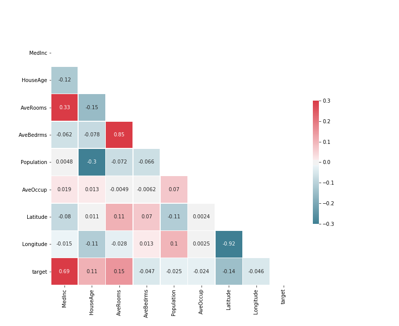
# Grab a data set from scikit-learn
from sklearn.datasets import fetch_california_housing
data = fetch_california_housing()
df = pd.DataFrame(
np.c_[data['data'], data['target']],
columns=data['feature_names'] + ['target']
)
# Create the correlation matrix
corr = df.corr()
# Generate a mask for the upper triangle; True = do NOT show
mask = np.zeros_like(corr, dtype=np.bool)
mask[np.triu_indices_from(mask)] = True
# Set up the matplotlib figure
f, ax = plt.subplots(figsize=(11, 9))
# Generate a custom diverging colormap
cmap = sns.diverging_palette(220, 10, as_cmap=True)
# Draw the heatmap with the mask and correct aspect ratio
# More details at https://seaborn.pydata.org/generated/seaborn.heatmap.html
sns.heatmap(
corr, # The data to plot
mask=mask, # Mask some cells
cmap=cmap, # What colors to plot the heatmap as
annot=True, # Should the values be plotted in the cells?
vmax=.3, # The maximum value of the legend. All higher vals will be same color
vmin=-.3, # The minimum value of the legend. All lower vals will be same color
center=0, # The center value of the legend. With divergent cmap, where white is
square=True, # Force cells to be square
linewidths=.5, # Width of lines that divide cells
cbar_kws={"shrink": .5} # Extra kwargs for the legend; in this case, shrink by 50%
)
# You can save this as a png with
# f.savefig('heatmap_colored_correlation_matrix_seaborn_python.png')
R
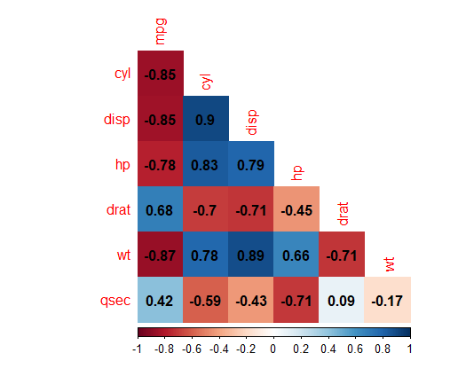
We will be creating our heatmap in two different ways. First, we will be using the corrplot package, which is tailor-made for the task and is very easy to use. Then, we will be using ggplot2 with geom_tile, which requires much more preprocessing to use, but then provides access to the entirety of the ggplot2 package for customization.
First, we will use corrplot:
# Install the corrplot package if necessary
# install.packages('corrplot')

# Load in the corrplot package
library(corrplot)

# Load in mtcars data
data(mtcars)

# Don't use too many variables or it will get messy!
mtcars <- mtcars[,c('mpg','cyl','disp','hp','drat','wt','qsec')]

# Create a corrgram
corrplot(cor(mtcars),
         # Using the color method for a heatmap
         method = 'color',
         # And the lower half only for easier readability
         type = 'lower',
         # Omit the 1's along the diagonal to bring variable names closer
         diag = FALSE,
         # Add the number on top of the color
         addCoef.col = 'black'
         )
This results in:
Now we will make the graph using ggplot2. We will also make a little use of dplyr and tidyr, and so we’ll load them all as a part of the tidyverse. This example makes use of this guide.
# Install the tidyverse if necessary
# install.packages('tidyverse')

# Load in the tidyverse
library(tidyverse)

# Load in mtcars data
data(mtcars)

# Create a correlation matrix.
C <- mtcars %>%
  # Don't use too many variables or it will get messy!
  # We use dplyr's select() here but there are other ways to limit variables, like []
  select(cyl, disp, drat, hp, mpg, qsec, wt) %>%
  # Correlation matrix
  cor()

# At this point, we can limit the matrix to just its lower half
# Note this will give weird results if you didn't select variables in alphabetical order earlier
C[upper.tri(C)] <- NA

C <- C %>%
  # Turn it into a data frame
  as.data.frame() %>%
  # with a column for the variable names.
  # We use dplyr's mutate to create this column but it could be made with $
  # the . here means "the data set we're working with"
  mutate(Variable = row.names(.))

# Use tidyr's pivot_longer to reshape to long format
# There are other ways to reshape too
C_Long <- pivot_longer(C, cols = c(mpg, cyl, disp, hp, drat, wt, qsec),
                       # We will want this option for sure if we dropped the
                       # upper half of the triangle earlier
                       values_drop_na = TRUE) %>%
  # Make both variables into factors
  mutate(Variable = factor(Variable),
         name = factor(name)) %>%
  # Reverse the order of one of the variables so that the x and y variables have
  # Opposing orders, common for a correlation matrix
  mutate(Variable = factor(Variable, levels = rev(levels(.$Variable))))

# Now we graph!
ggplot(C_Long,
       # Our x and y axis are Variable and name
       # And we want to fill each cell with the value
       aes(x = Variable, y = name, fill = value))+
  # geom_tile to draw the graph
  geom_tile() +
  # Color the graph as we like
  # Here our negative correlations are red, positive are blue
  # gradient2 instead of gradient gives us a "mid" color which we can make white
  scale_fill_gradient2(low = "red", high = "blue", mid = "white",
                       midpoint = 0, limit = c(-1,1), space = "Lab",
                       name="Pearson\nCorrelation") +
  # Axis names don't make much sense
  labs(x = NULL, y = NULL) +
  # We don't need that background
  theme_minimal() +
  # If we need more room for variable names at the bottom, rotate them
  theme(axis.text.x = element_text(angle = 45, vjust = 1,
                                   size = 12, hjust = 1)) +
  # We want those cells to be square!
  coord_fixed() +
  # If you also want the correlations to be written directly on there, add geom_text
  geom_text(aes(label = round(value,3)))
This results in:
SAS
See this guide.
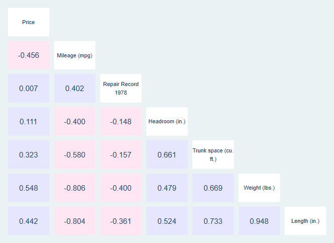
Stata
Stata has the installable package corrtable which produces heatmap correlation tables. Handily, it puts the variable labels (or names, if labels aren’t available) along the diagonal where they are easy to read. Note that it does run quite slowly.
* Install corrtable if necessary
* ssc install corrtable

* Get auto data
sysuse auto.dta, clear

* Make correlation table
* The half option just shows the lower triangle and puts variable names on the axis.
* The flag1 and howflag1 options tell corrtable to plot positive correlations (r(rho > 0))
* as blue (blue*.1)
* and flag2 and howflag2 similarly tell it to plot negative correlations as pink.
corrtable price-length, half flag1(r(rho) > 0) howflag1(plotregion(color(blue * 0.1))) flag2(r(rho) < 0) howflag2(plotregion(color(pink*0.1)))
This results in: