Introduction
A density plot visualises the distribution of data over a continuous interval (or time period). Density Plots are not affected by the number of bins (each bar used in a typical histogram) used, thus, they are better at visualizing the shape of the distribution than a histogram unless the bins in the histogram have a theoretical meaning.
Keep in Mind
- Notice that the variable on the x-axis should be continuous. Density plots are not designed for use with discrete variables.
Also Consider
= You might also want to know how to make a histogram or a line graph, click Histogram or Line graph for more information.
Implementations
Python
In this example, we’ll use seaborn, a declarative plotting library that provides a quick and easy way to produce density plots. It builds on matplotlib.
# You may need to install seaborn on the command line using 'pip install seaborn' or 'conda install seaborn'
import seaborn as sns

# Set a theme for seaborn
sns.set_theme(style="darkgrid")

# Load the example diamonds dataset
diamonds = sns.load_dataset("diamonds")

# Take a look at the data
print(diamonds.head())
| carat | cut | color | clarity | depth | table | price | x | y | z | |
|---|---|---|---|---|---|---|---|---|---|---|
| 0 | 0.23 | Ideal | E | SI2 | 61.5 | 55.0 | 326 | 3.95 | 3.98 | 2.43 |
| 1 | 0.21 | Premium | E | SI1 | 59.8 | 61.0 | 326 | 3.89 | 3.84 | 2.31 |
| 2 | 0.23 | Good | E | VS1 | 56.9 | 65.0 | 327 | 4.05 | 4.07 | 2.31 |
| 3 | 0.29 | Premium | I | VS2 | 62.4 | 58.0 | 334 | 4.20 | 4.23 | 2.63 |
| 4 | 0.31 | Good | J | SI2 | 63.3 | 58.0 | 335 | 4.34 | 4.35 | 2.75 |
sns.kdeplot(data=diamonds, x="price", cut=0);

This is basic, but there are lots of ways to adjust it through keyword arguments (you can see these by running help(sns.kdeplot)) or via calling functions on the matplotlib ax object that running sns.kdeplot returns when not followed by ;. In this simple example, the cut keyword argument forces the density estimate to end at the end-points of the data–which makes sense for a variable like price, which has a hard cut-off at 0.
Let’s use further keyword arguments to enrich the plot, including different colours (‘hues’) for each cut of diamond. One keyword argument that may not be obvious is hue_order. The default function call would have arranged the cut types so that the ‘Fair’ cut obscured the other types, so the argument passed to the hue_order keyword below reverses the order of the unique list of diamond cuts via [::-1].
sns.kdeplot(data=diamonds,
            x="price",
            hue="cut",
            hue_order=diamonds['cut'].unique()[::-1],
            fill=True,
            alpha=.4,
            linewidth=0.5,
            cut=0.);

R
For this R demonstration, we are going to use ggplot2 package to create a density plot. Additionally, we will use the dataset diamonds that is made available by the ggplot2 package.
To begin with this R demonstration, make sure that we install and load all the useful packages that we need it.
# load necessary packages
library(ggplot2)
library(viridis)
library(RColorBrewer)
library(tidyverse)
library(ggthemes)
library(ggpubr)
library(datasets)
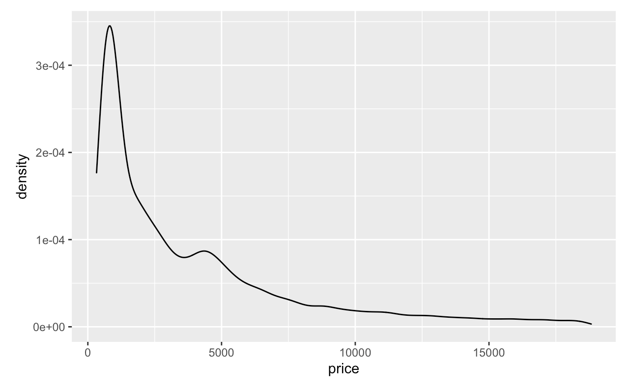
Next, in order to make a density plot, we are going to use the ggplot() and geom_density() functions. We will specify price as our x-axis.
ggplot(diamonds, aes(x = price)) +
  geom_density()
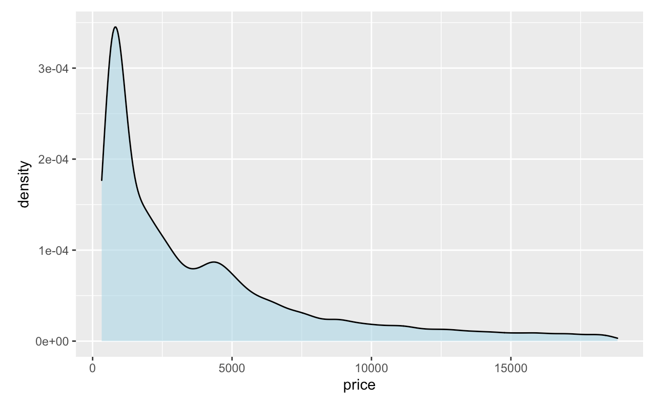
We can always change the color of the density plot using the col argument and fill the color inside the density plot using fill argument. Furthermore, we can specify the degree of transparency density fill area using the argument alpha where alpha ranges from 0 to 1.
ggplot(diamonds, aes(x = price))+
  geom_density(fill = "lightblue", col = 'black', alpha = 0.6)
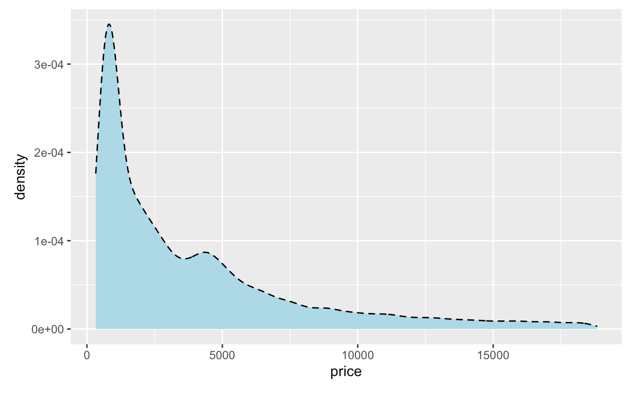
 We can also change the type of line of the density plot as well by adding
 linetype= inside geom_density().
ggplot(diamonds, aes(x = price)) +
  geom_density(fill = "lightblue", col = 'black', linetype = "dashed")
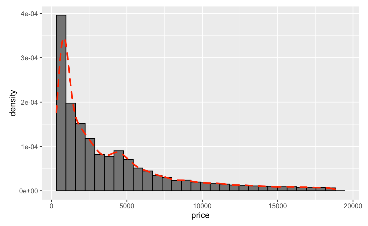
 Furthermore, you can also combine both histogram and density plots together.
ggplot(diamonds, aes(x = price)) +
  geom_histogram(aes(y = ..density..), colour = "black", fill = "grey45") +
  geom_density(col = "red", size = 1,linetype = "dashed")
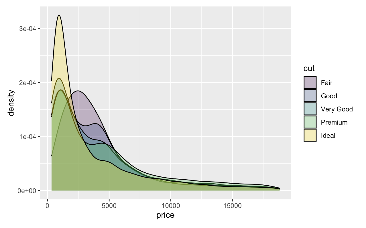
What happen if we want to make multiple densities?
For example, we want to make multiple densities plots for price based on the type of cut, all we need to do is adding fill=cut inside aes().
ggplot(data=diamonds, aes(x = price, fill = cut)) +
    geom_density(adjust = 1.5, alpha = .3)
Stata
For this demonstration, we will use the plotplainblind scheme, a community-contributed color and grpah scheme for plots that greatly improves over Stata’s default plot color schemes especially for colorblind viewers. For more on using schemes in Stata, see here.
* Install the blindschemes set of graph schemes, including plottig
ssc install blindschemes
* Shows the set of available schemes
graph query, schemes

* Load diamonds data
import delimited "https://vincentarelbundock.github.io/Rdatasets/csv/ggplot2/diamonds.csv", clear
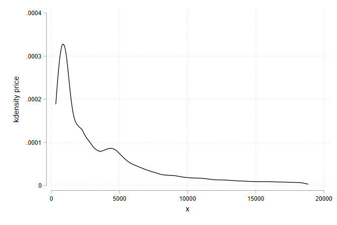
We can build a basic density plot using the kdensity subcommand of twoway:
* Plot the kernel density with plotplain theming
twoway kdensity price, scheme(plotplainblind)
To overlay densities for multiple variables or multiple groups, it is possible to use the standard twoway graph stacking syntax:
* Plot the density of two separate columns
twoway (kdensity depth) (kdensity table), scheme(plotplainblind)
* Plot the same variable separately by group, overlaid on a single set of axes
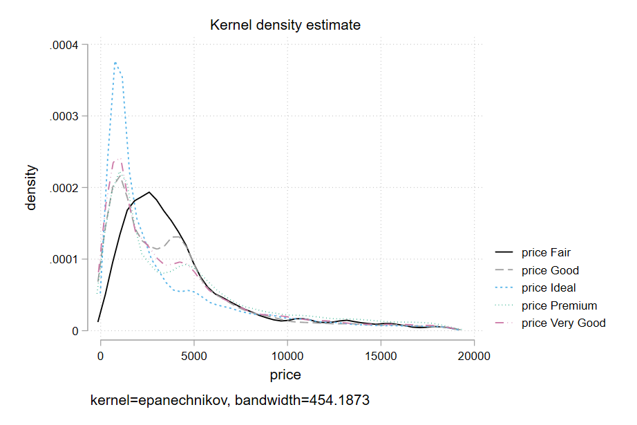
twoway (kdensity price if cut == "Fair", lcolor(blue)) (kdensity price if cut == "Good", lcolor(red)), scheme(plotplainblind) legend(lab(1 "Cut: Fair") lab(2 "Cut: Good"))
However, the syntax for doing separate densities by group can get onerous very quickly with more than a handful of groups, noting that you’ll have to specify each group with an if by hand, be careful about the color/presentation of each line, and do the legend yourself.
Much easier for by-group kernel densities is the mkdensity package, which still uses kdensity under the hood, but just handles some of this busywork for you. On the other hand it doesn’t accept a scheme() option. But you can still use it via set scheme.
The downside of this approach, rather than doing it by hand, is that it relies on
set scheme plotplainblind

* if necessary, install with ssc install mkdensity
mkdensity price, over(cut)