Introduction
A scatterplot is a useful and straightforward way to visualize the relationship between two variables,eventually revealing a correlation. It is often used to make initial diagnoses before any other statistical analyses are conducted.This tutorial will not only teach you how to make scatterplots, but also explore the ways to help you design your own styling scatterplots.
Keep in Mind
- REMEMBER always clean your dataset before you try to make scatterplots since in the real world, the dataset is always messier than the
irisdataset used below. - Scatterplots may not work well if the variables that you are interested in are discrete, or if there are a large number of data points.
- Be more careful if you have Date (which is time-series data) as your x-variable, Date can be very tricky in many ways.
Also Consider
- If one of your variables is discrete, then instead of scatterplots, you may want to check how to make bar graphs here.
Specifically in R:
- Formatting graph legends is important for styling scatterplots. So check here if you want to work with graph legends.
- If you are working with time series visualization with ggplot2 package, see here for more help.
- Check here for more data visualization with ggplot2 package.
Implementations
R
For this R demonstration, we will introduce how to use ggplot2 package to create nice scatterplots. First, we load all the libraries we will need.
library(ggplot2)
library(viridis)
library(dplyr)
library(RColorBrewer)
library(tidyverse)
library(ggthemes)
library(ggpubr)
Step 1: Basic Scatterplot
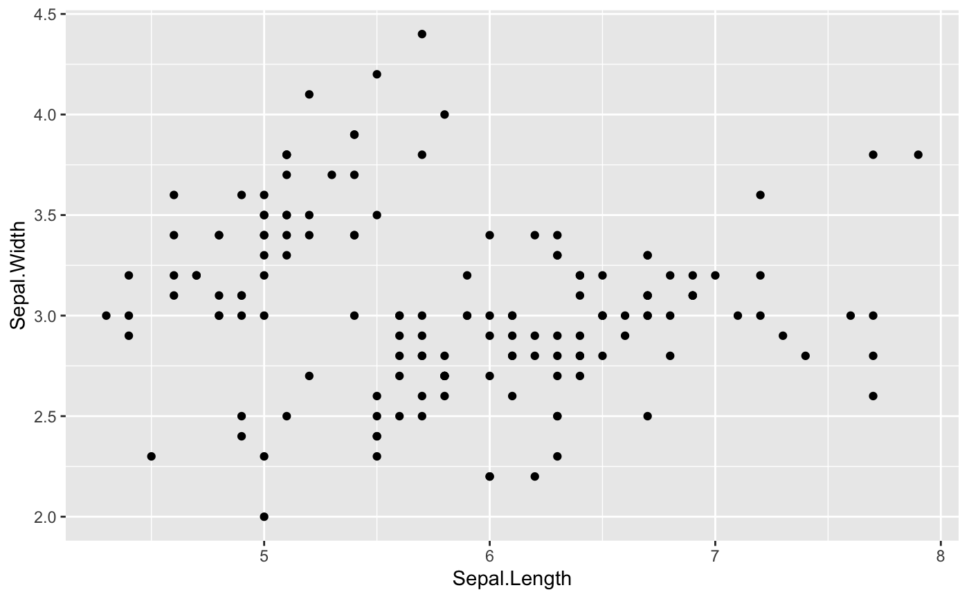
Let’s start with the basic scatterplot. Say we want to check the relationship between Sepal width and Sepal length of the iris species. There are a few steps to construct the scatterplot:
- Step1: specify the dataset that we want to visualize
- Step2: tell which variable to show on x and y axis
- Step3: add a
geom_point()in order to show the points
If you have questions about how to use ggplot and aes, check Here for more help.
ggplot(data = iris, aes(
  ## Put Sepal.Length on the x-axis, Sepal.Width on the y-axis
  x=Sepal.Length, y=Sepal.Width))+
  ## Make it a scatterplot with geom_point()
  geom_point()
Step 2: Map a variable to marker feature
One of the most powerful and magic abilities of the ggplot2 package is to map a variable to marker features.
Notice that attributes set outside of aes() apply to all points (like size=4 here), while attributes set inside of aes() set the attribute separately for the values of the variable.
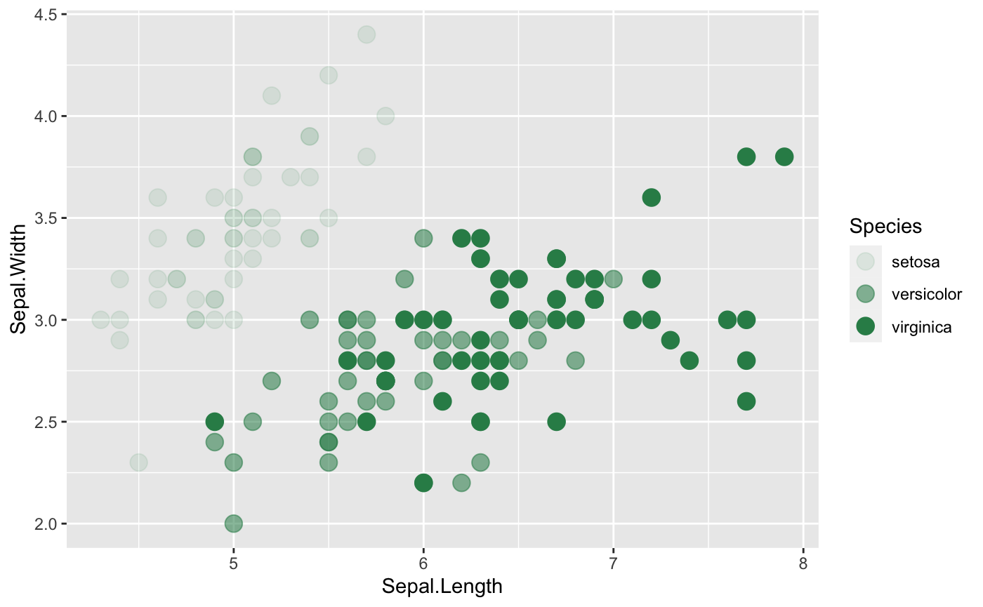
Transparency
We can distinguish the Species by alpha (transparency).
ggplot(iris, aes(x=Sepal.Length, y=Sepal.Width,
                 ## Where transparency comes in
                 alpha=Species)) +
    geom_point(size =4, color="seagreen")
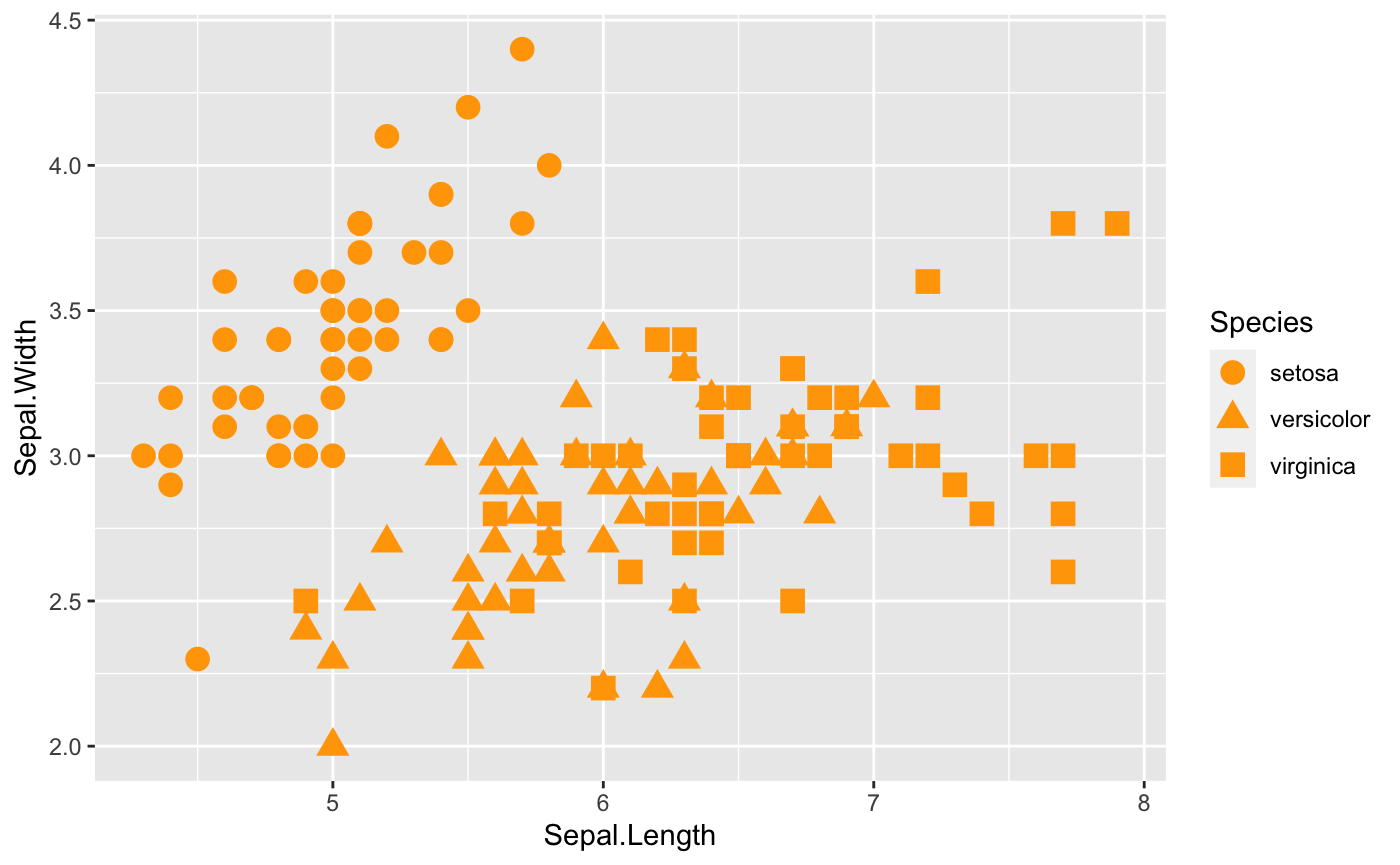
Shape
shape is also a common way to help us to see relationship between two variables within different groups. Additionally, you can always change the shape of the points. Check here for more ideas.
ggplot(iris, aes(x=Sepal.Length, y=Sepal.Width,
                 ## Where shape comes in
                 shape=Species)) +
    geom_point(size = 4,color="orange")
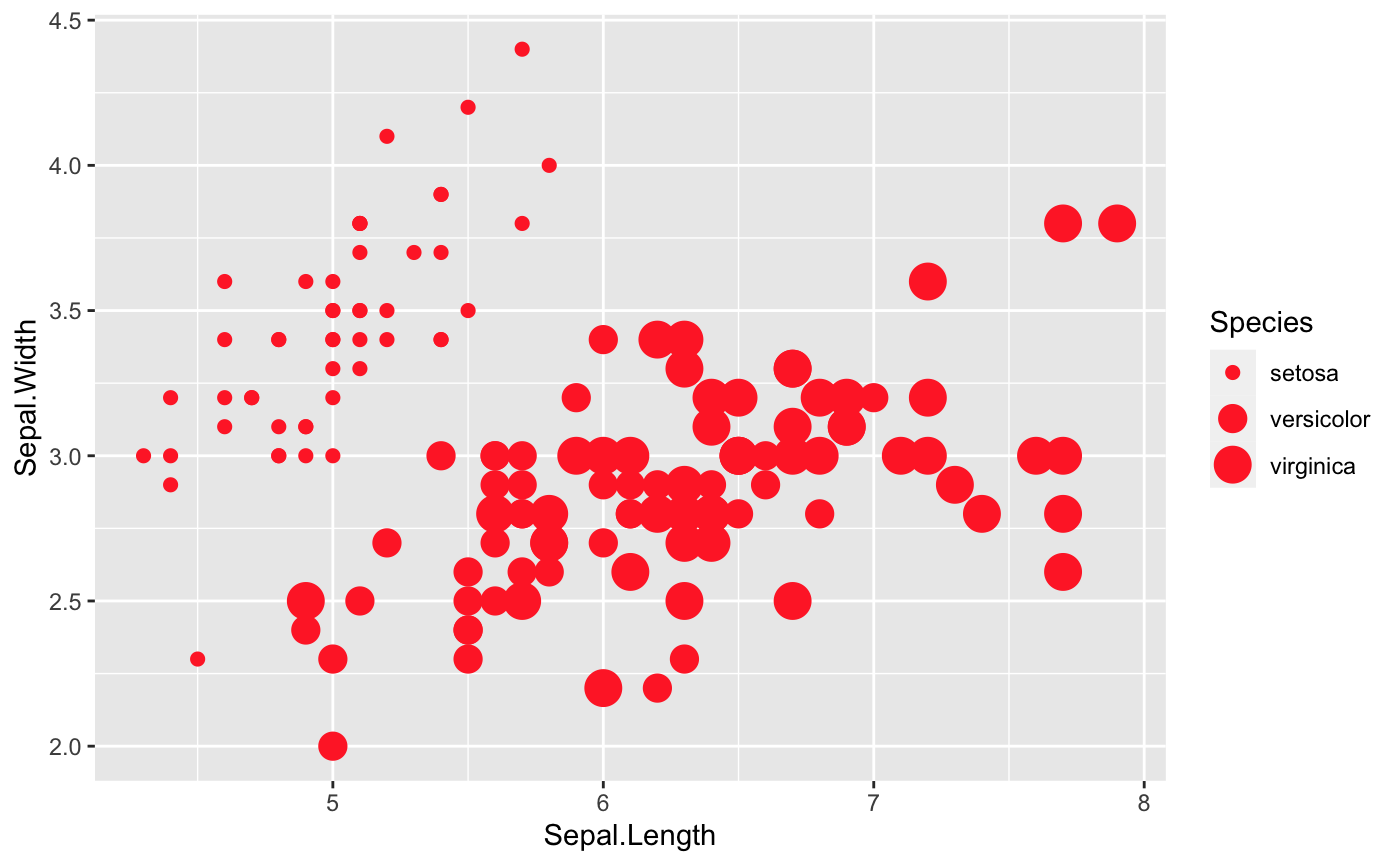
Size
size is a great option that we can take a look at as well. However, note that size will work better with continuous variables.
ggplot(iris, aes(x=Sepal.Length, y=Sepal.Width,
                 ## Where size comes in
                 size=Species)) +
    geom_point(shape = 18, color = "#FC4E07")
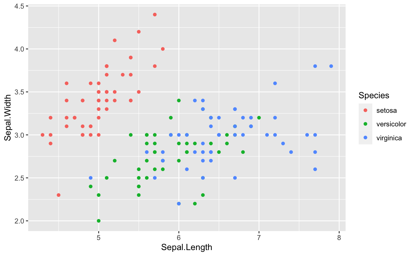
Color
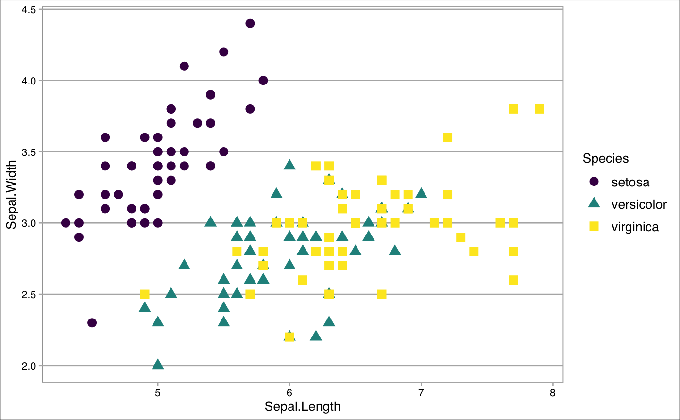
Last but not least, let’s color these points depends on the variable Species in the iris dataset.
## First, we need to make sure that 'Species' is a factor variable
## class(iris$Species)

## Since 'Species' is already a factor variable, we do not need to do conversion
## However, in case 'Species' is not a factor variable, we can solve this question using as.factor() function, like below
## iris$Species <- as.factor(iris$Species)

## Then, we are ready to plot
ggplot(data = iris, aes(x=Sepal.Length, y=Sepal.Width,
                        ## distinguish the species by color
                        color=Species))+
  geom_point()
-
Note
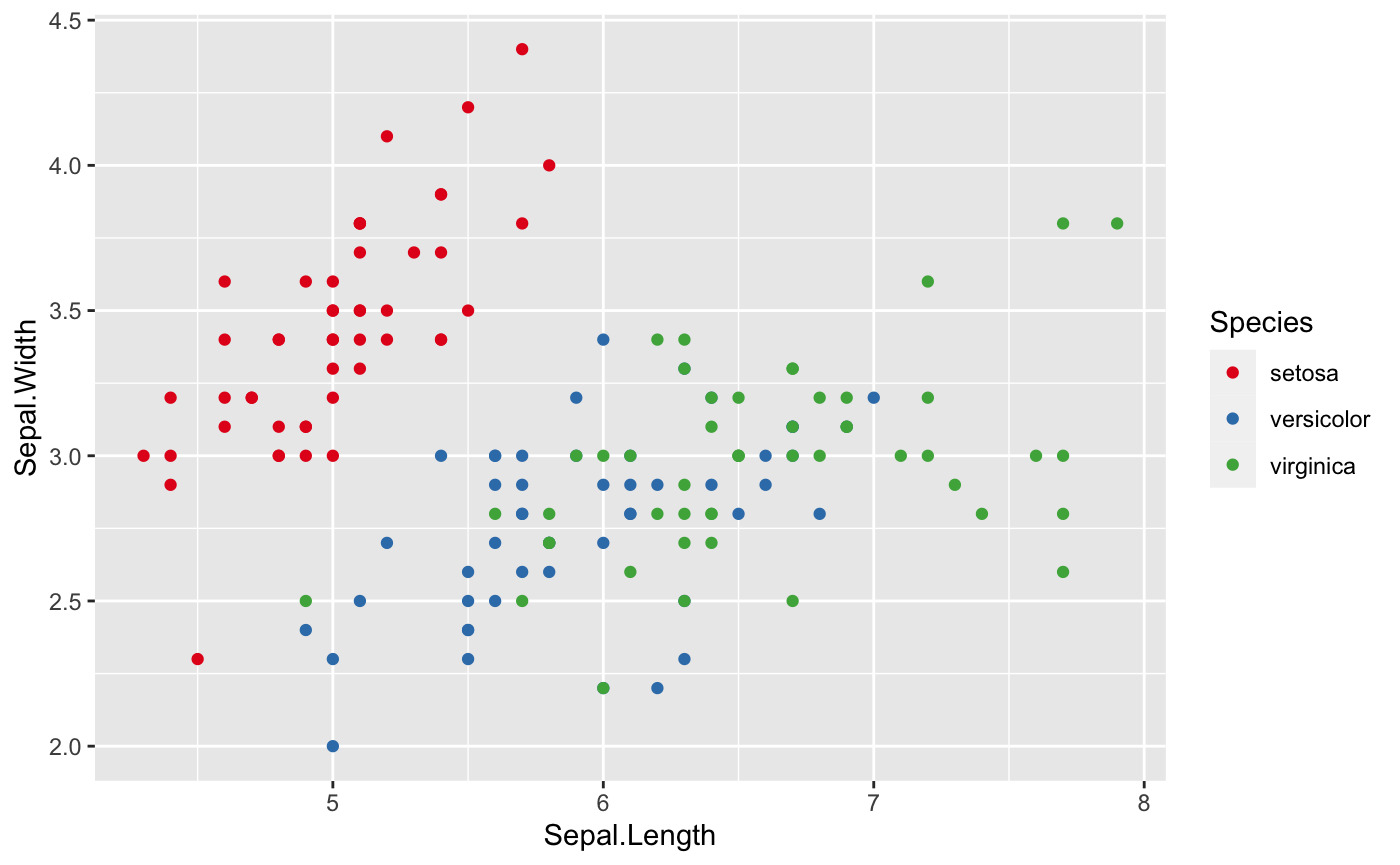
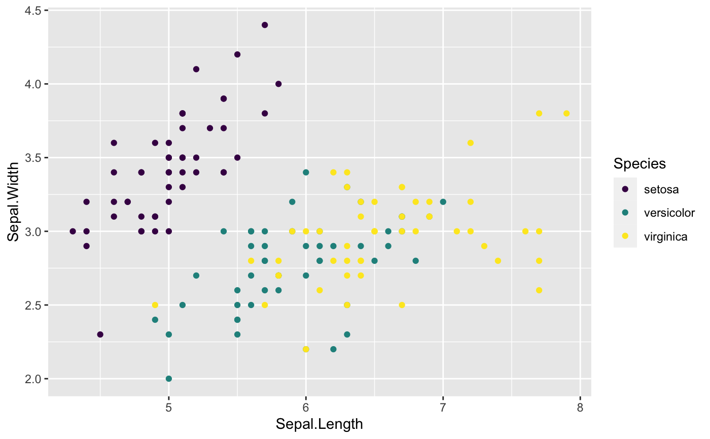
- If you do not like the default colors in the ggplot2, there are a couple of ways to change that.The RColorBrewerpackage will definitely help. If you want to know more about RColorBrewer package,see here. Additionally,the viridis package is also very helpful to change the default colors. For more information of the viridis package, check here.
- If you do not like all the options that the RColorBrewer and viridis packages provide, see here to work with color in the ggplot2 package.
ggplot(data = iris, aes(x=Sepal.Length, y=Sepal.Width, color=Species))+
  geom_point()+
  ## Where RColorBrewer package comes in
  scale_colour_brewer(palette = "Set1") ## There are more options available for palette

ggplot(data = iris, aes(x=Sepal.Length, y=Sepal.Width, color=Species))+
  geom_point()+
  ## Where viridis package comes in
  scale_color_viridis(discrete=TRUE,option = "D")  ## There are more options to choose
This first graph is using RColorBrewer package,and the second graph is using viridis package.
Put all the options together
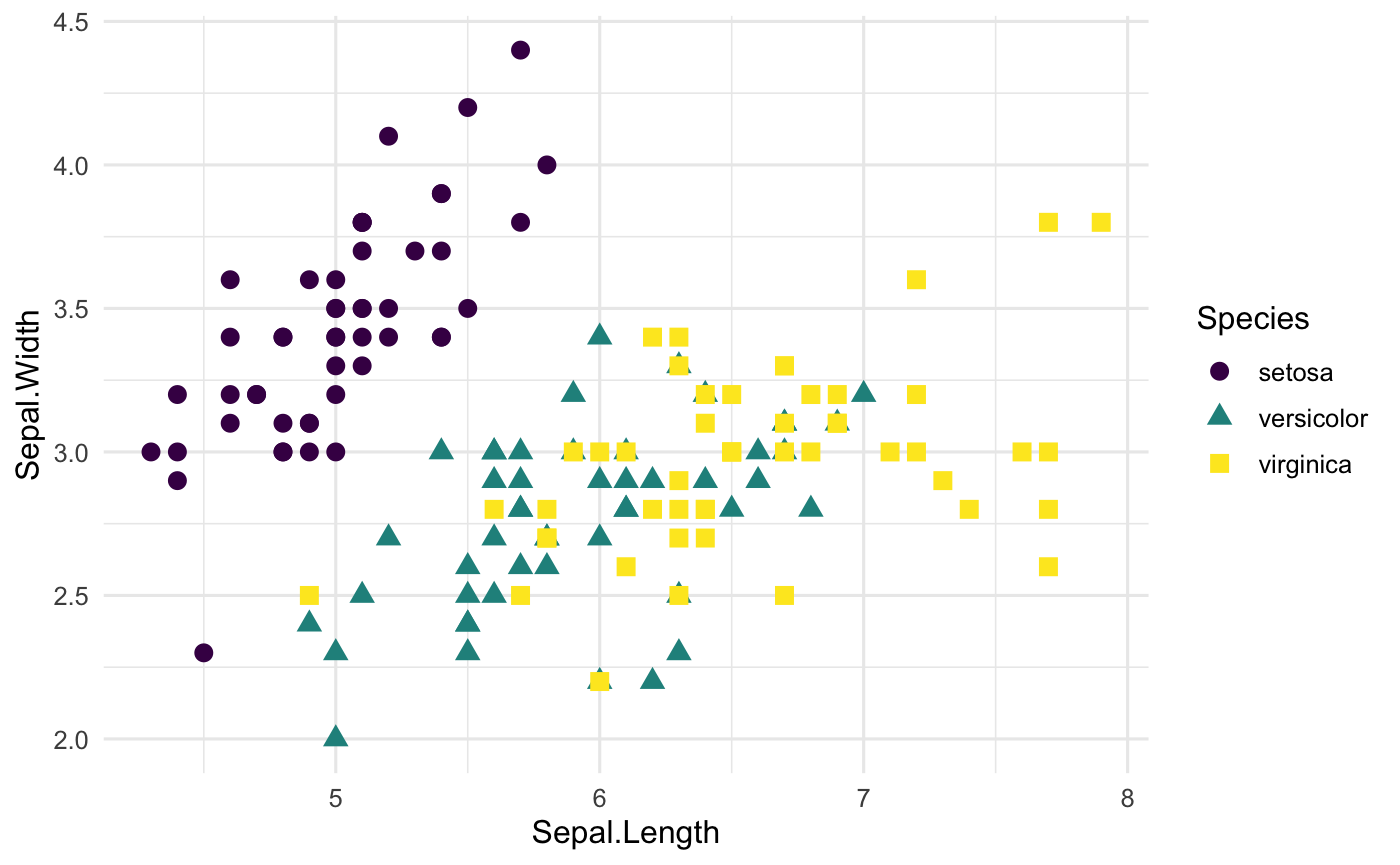
Of course, we can always mix color,transparency,shape and size together to get prettier plot. Simply set more than one of them in aes()!
Step 3: Find the comfortable themes
The next step that we can do is to figure out what the most fittable themes to match all the hard work we have done above.
Themes from **ggplot2 package**
In fact, ggplot2 package has many cool themes available alreay such as theme_classic(), theme_minimal() and theme_bw(). Another famous theme is the dark theme: theme_dark(). Let’s check out some of them.
ggplot(iris, aes(x=Sepal.Length, y=Sepal.Width,
                 col=Species,
                 shape=Species)) +
  geom_point(size=3) +
  scale_color_viridis(discrete=TRUE,option = "D") +
  theme_minimal(base_size = 12)
Themes from the ggthemes package
ggthemes package is also worth to check out for working any plots (maps,time-series data, and any other plots) that you are working on. theme_gdocs(), theme_tufte(), and theme_calc() all work very well. See here to get more cool themes.
ggplot(iris, aes(x=Sepal.Length, y=Sepal.Width,
                 col=Species,
                 shape=Species)) +
  geom_point(size=3) +
  scale_color_viridis(discrete=TRUE,option = "D") +
  ## Using the theme_tufte()
  theme_tufte()
Create by your own
If you do not like themes that ggplot2 and ggthemes packages have, don’t worry. You can always create your own style for your themes. Check here to desgin your own unique style.
Step 4: Play with labels
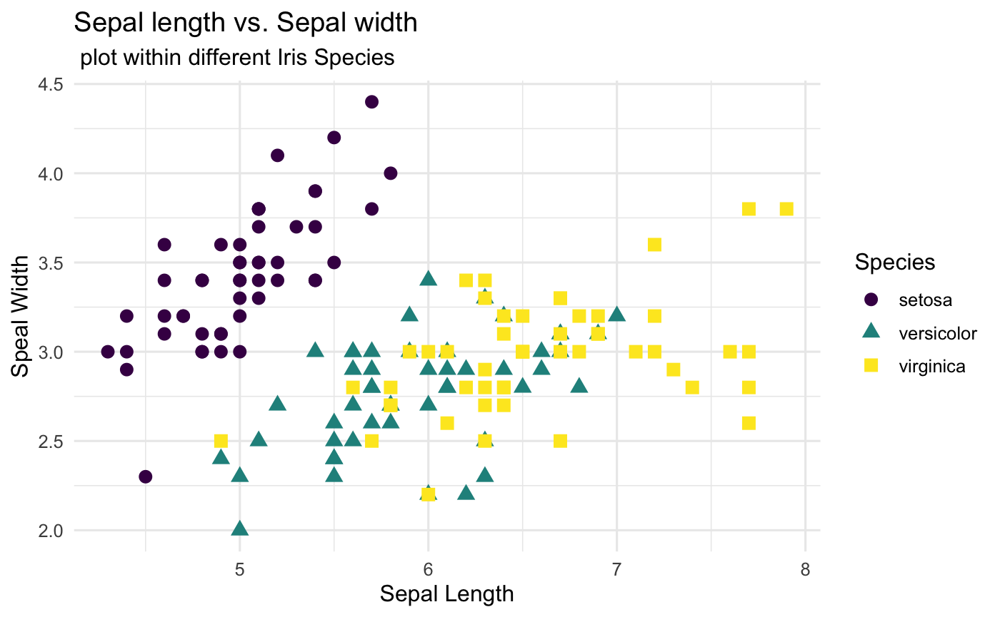
It is time to label all the useful information to make the plot be clear to your audiences.
Basic Labelling
Both labs() and ggtitle() are great tools to deal with labelling information. In the following code, we provide the example how to use labs() to label the all the things that we need. Take a look here if you want to learn how to use ggtitle().
ggplot(iris, aes(x=Sepal.Length, y=Sepal.Width,
                 col=Species,
                 shape=Species)) +
  geom_point(size=3) +
  scale_color_viridis(discrete=TRUE,option = "D") +
  theme_minimal(base_size = 12)+
  ## Where the labelling comes in
  labs(
    ## Tell people what x and y variables are
    x="Sepal Length",
    y="Sepal Width",
    ## Title of the plot
    title = "Sepal length vs. Sepal width",
    subtitle = " plot within different Iris Species"
  )
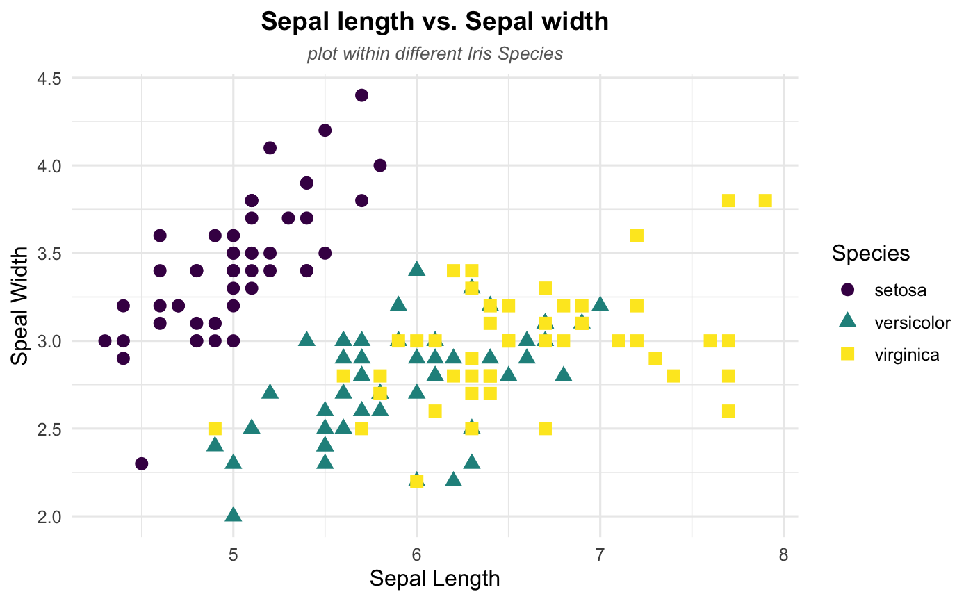
Postion and Appearance
After the basic labelling, we want to make them nicer by playing around the postion and appearance (text size, color and faces).
ggplot(iris, aes(x=Sepal.Length, y=Sepal.Width,
                 col=Species,
                 shape=Species)) +
  geom_point(size=3) +
  scale_color_viridis(discrete=TRUE,option = "D") +
  labs(
    x="Sepal Length",
    y="Sepal Width",
    title = "Sepal length vs. Sepal width",
    subtitle = "plot within different Iris Species"
  )+
  theme_minimal(base_size = 12) +
  ## Change the title and subtitle position to the center
  theme(plot.title = element_text(hjust = 0.5),
        plot.subtitle = element_text(hjust = 0.5))+
  ## Change the appearance of the title and subtitle
  theme (plot.title = element_text(color = "black", size = 14, face = "bold"),
         plot.subtitle = element_text(color = "grey40",size = 10, face = 'italic')
         )
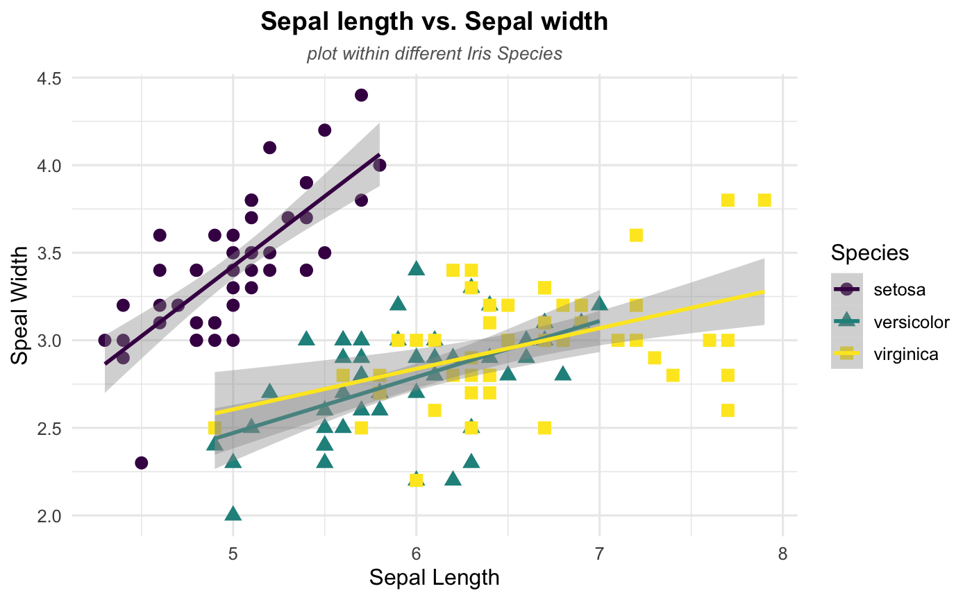
Step 5: Show some patterns
After done with step 4, you should end with a very neat and unquie plot. Let’s end up with this tutorial by checking whether there are some specific patterns in our dataset.
Linear Trend
According to the plot, it seems like there exists a linear relationship between sepal length and sepal width. Thus, let’s add a linear trend to our scattplot to help readers see the pattern more directly using geom_smooth(). Note that the method argument in geom_smooth() allows to apply different smoothing method like glm, loess and more. See the doc for more.
ggplot(iris, aes(x=Sepal.Length, y=Sepal.Width,
                 col=Species,
                 shape=Species)) +
  geom_point(size=3) +
  scale_color_viridis(discrete=TRUE,option = "D") +
  labs(
    x="Sepal Length",
    y="Sepal Width",
    title = "Sepal length vs. Sepal width",
    subtitle = "plot within different Iris Species"
  )+
  theme_minimal(base_size = 12) +
  theme(plot.title = element_text(hjust = 0.5),
        plot.subtitle = element_text(hjust = 0.5))+
  theme (plot.title = element_text(color = "black", size = 14, face = "bold"),
         plot.subtitle = element_text(color = "grey40",size = 10, face = 'italic')) +
  ## Where linear trend + confidence interval come in
  geom_smooth(method = 'lm',se=TRUE)
Congratulations!!! You just make your own style of scatterplots if you are following all the steps above and try to play around the different options.
Stata
For this Stata demonstration, I will use a combination of scatter and twoway, both native commands in Stata, to create all the figures trying to emulate the structure you see above in R.
While I want to use only official commands within Stata, I will use Ben Jann’s grstyle to set some basic graph themes, although I’ll keep them minimalistic. see help grstyle for more options.
Setup
To replicate all figures here, you will need to make sure you have grstyle installed in your computer. To make things comparable to the R example, I will also use the Iris dataset.
Other than that, I use the following setup:
ssc install grstyle
grstyle init
grstyle color background white
grstyle set legend , nobox
webuse iris, clear
Basic Scatterplot
Let’s start with the basic scatterplot. Say we want to check the relationship between Sepal width and Sepal length of the iris species. Basic scatterplots can be obtained using the command scatter.
The general syntax is as follows:
scatter yvar1 [yvar2 yvar3 ...] xvar, [options]
You can choose to use one or more variables that will be measured in the vertical axis yvar. The last variable xvar will be used for the horizontal axis. For the example, I will plot only two variables: Sepal width and Sepal length.
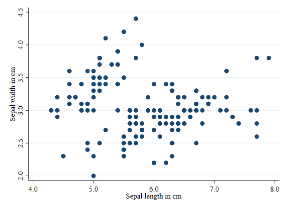
scatter sepwid seplen
Scatterplot by groups
Something you may want to do when producing Scatterplots is to visually separate different groups within the same scatterplot. For example, in the Iris data, we would like to see how sepal dimensions change by Iris type. To be able to do this, you need to use twoway to overlap multiple graphs together.
There are two ways to create multiple overalping plots. The easier one is this:
twoway  scatter sepwid seplen if iris==1 || ///
        scatter sepwid seplen if iris==2 || ///
        scatter sepwid seplen if iris==3
| Where each subplot (by iris type) is separated using * | . The tripple forward slash */// is used to break the line, and avoid code that is too long to follow. |
The second option, my preferred option, is to separate each subplot, using parenthesis to encapsulate each subplot:
twoway  (scatter sepwid seplen if iris==1) ///
        (scatter sepwid seplen if iris==2) ///
        (scatter sepwid seplen if iris==3)
This is convenient because allows you to add and differentiate options that affect a subplot, vs options that affect the whole twoway plot.
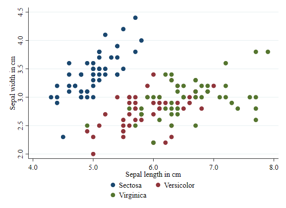
One more thing. The basic plot (as above) differentiates each plot by color, but uses generic labels for each subgroup. So lets add labels for the three types of Irises.
twoway  (scatter sepwid seplen if iris==1) ///
        (scatter sepwid seplen if iris==2) ///
        (scatter sepwid seplen if iris==3), ///
        legend(order(1 "Sectosa" 2 "Versicolor" 3 "Virginica"))
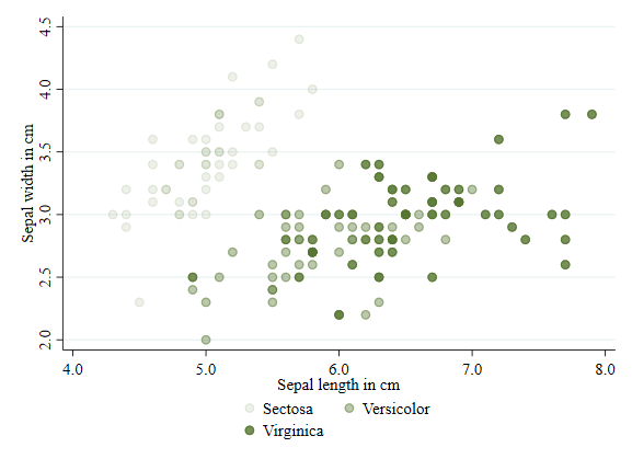
Transparency
Starting in Stata 15, it is possible to add transparency to a figure. See that this is done using the option `color()’. For fun, Im using the same color on each subgroup: “forest_green”.
twoway  (scatter sepwid seplen if iris==1, color(forest_green%10)) ///
        (scatter sepwid seplen if iris==2, color(forest_green%40)) ///
        (scatter sepwid seplen if iris==3, color(forest_green%80)), ///
        legend(order(1 "Sectosa" 2 "Versicolor" 3 "Virginica"))
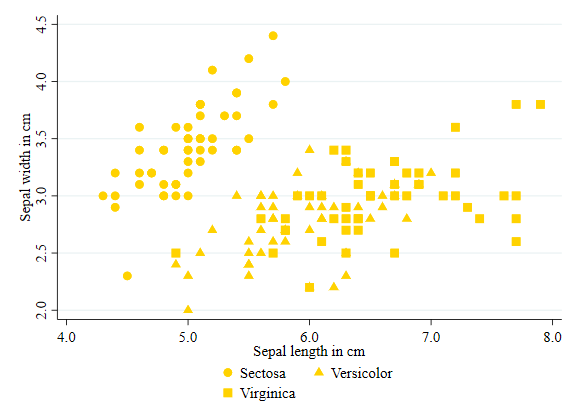
Shape/symbols
In Stata, you will use the word symbol rather than shape to differentiate the markers in a scatter plot.
Symbols can be modified using the option symbol(). To see all options for symbols, you can type palette symbol.
twoway  (scatter sepwid seplen if iris==1, color(gold) symbol(O)) ///
        (scatter sepwid seplen if iris==2, color(gold) symbol(T)) ///
        (scatter sepwid seplen if iris==3, color(gold) symbol(S)), ///
        legend(order(1 "Sectosa" 2 "Versicolor" 3 "Virginica"))
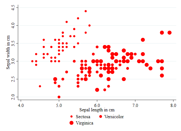
Size
Size of a marker can be modified using the option size(). See help markersizestyle for all available size options.
twoway  (scatter sepwid seplen if iris==1, color(red) msize(small)) ///
        (scatter sepwid seplen if iris==2, color(red) msize(medium)) ///
        (scatter sepwid seplen if iris==3, color(red) msize(large)), ///
        legend(order(1 "Sectosa" 2 "Versicolor" 3 "Virginica"))
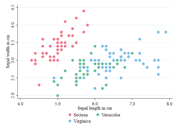
Color
This is the first option I applied earlier. However, this is a good opportunity to point out all the color options Stata has. See help colorstyle##colorstyle for options. In the example below I use the RBG approach to choose colors.
twoway  (scatter sepwid seplen if iris==1, color("240 120 140") ) ///
        (scatter sepwid seplen if iris==2, color("100 190 150") ) ///
        (scatter sepwid seplen if iris==3, color("125 190 230") ), ///
        legend(order(1 "Sectosa" 2 "Versicolor" 3 "Virginica"))
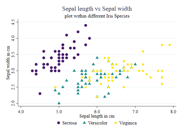
Labels, Titles and Subtitles
I mentioned this earlier. Stata uses a variable label for the plot axis titles. However, you can modify that using the options xtitle() and ytitle().
It is also possible to add a title and subtitle to the figure, using options title() and subtitle()
twoway  (scatter sepwid seplen if iris==1, color("72 27 109") symbol(O)) ///
        (scatter sepwid seplen if iris==2, color("33 144 140") symbol(T)) ///
        (scatter sepwid seplen if iris==3, color("253 231 37") symbol(s)), ///
        legend(order(1 "Sectosa" 2 "Versicolor" 3 "Virginica") col(3)) ///
		    title(Sepal length vs Sepal width) subtitle(plot within different Iris Species)
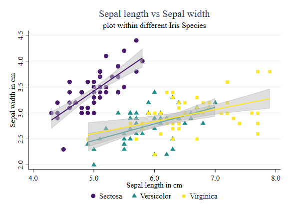
Showing some patterns
Something else you may want to do is add bivarite fitted lines to emphasize particular relationships within pairs of variables. You can do this by adding additional subplots that will produce this information.
In the example below, I add linear fitted values for all cases. I make sure to use the same line color, so they are consistent with the scatter plot.
twoway  (scatter sepwid seplen if iris==1, color("72 27 109") symbol(O)) ///
        (scatter sepwid seplen if iris==2, color("33 144 140") symbol(T)) ///
        (scatter sepwid seplen if iris==3, color("253 231 37") symbol(s)) ///
		    (lfitci sepwid seplen if iris==1, clcolor("72 27 109") clwidth(0.5)  acolor(%50) ) ///
        (lfitci sepwid seplen if iris==2, clcolor("33 144 140") clwidth(0.5)  acolor(%50) ) ///
        (lfitci sepwid seplen if iris==3, clcolor("253 231 37") clwidth(0.5)  acolor(%50) ), ///
        legend(order(1 "Sectosa" 2 "Versicolor" 3 "Virginica") col(3)) ///
		    title(Sepal length vs Sepal width) subtitle(plot within different Iris Species)	///
		    xtitle(Sepal length in cm) ytitle(Sepal width in cm)
Of course, you can be more sophisticated, and use a local polynomial to identify those relationships:
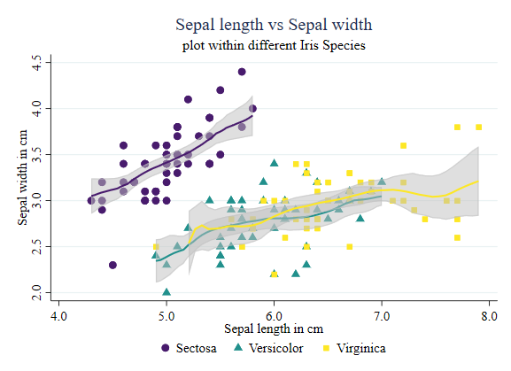
twoway  (scatter sepwid seplen if iris==1, color("72 27 109") symbol(O)) ///
        (scatter sepwid seplen if iris==2, color("33 144 140") symbol(T)) ///
        (scatter sepwid seplen if iris==3, color("253 231 37") symbol(s)) ///
		    (lpolyci sepwid seplen if iris==1, clcolor("72 27 109") clwidth(0.5)  acolor(%50) ) ///
        (lpolyci sepwid seplen if iris==2, clcolor("33 144 140") clwidth(0.5)  acolor(%50) ) ///
        (lpolyci sepwid seplen if iris==3, clcolor("253 231 37") clwidth(0.5)  acolor(%50) ), ///
        legend(order(1 "Sectosa" 2 "Versicolor" 3 "Virginica") col(3)) ///
		    title(Sepal length vs Sepal width) subtitle(plot within different Iris Species) ///
		    xtitle(Sepal length in cm) ytitle(Sepal width in cm)
And done. You can use the above guide to modify your plots as needed.