Animated graphs
This page provides a brief explanation on how to make animated graphs. Animated graphs help present information that changes over a time period (such as years) or space (such as by state). They are one straightforward way of presenting three-dimensional data in a two-dimensional space.
Keep in Mind
- Animated graphs can be in any shape: line, plot, bar, etc.
- Because the graph will be moving, it is often a good idea to start with a relatively simple graph. Otherwise the viewer can get overwhelmed.
- Carefully think about the duration of your animation and the number of frames to determine the speed and fluidity at which it moves.
- The height and width dimensions are important for presenting the animated details
Also Consider
- You may need to do some data manipulation to create the right animated graph.
- Check the presentation Figures, there are many charts we can animate.
Implementations
Notes on implementations:
R
There are many great packages to do animated graphs such as gganimate and plotly.
Here we use gganimate and ggplot2 to do animated bar graphs, and gifski to save the results.
gganimate has the benefit of being able to animate any graph made in ggplot2. This means that all the other graphs in the Figures section, which use ggplot2 for the R implementations, can be animated using gganimate.
# Load in necessary packages
library(ggplot2)
library(gganimate)
library(gifski)
library(dplyr)

# Load in desired data (gapminder)
library(gapminder)
gganimate works by taking standard ggplot2 input and adding a transition_ function which specifies what should change from frame to frame, and how. transition_states() is fairly easy to work with, as it simply takes an ordered variable and transitions from value to value of that variable. Here we use year, and so it will remake the graph for each year, and transition between them. ease_aes() specifies how to smoothly transition between states.
graph_data1 <- gapminder  %>% filter(continent=="Oceania")

# first use ggplot for the graph
ggplot(graph_data1, aes(x=country, y=gdpPercap, fill=country)) +
  geom_bar(stat='identity') +
  theme_bw() + # then set the gganimate,
  transition_states( # to specify the transition, here we specify
    year,
    transition_length = 2, # How long to spend on each transition
    state_length = 1) + # How long to spend in each state (these are relative values, not numbers of frames)
  ease_aes('sine-in-out') + # to control easing of aesthetics
  labs(title = 'GDP per Capita in Year {closest_state}', # title with the timestamp period
  subtitle = 'Oceania Countries (1952 - 2007)')
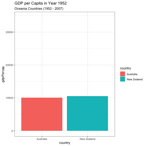
anim_save("graph1.gif") # to save the graph as gif
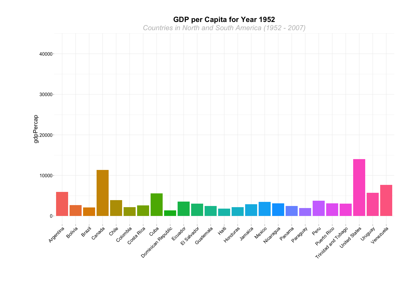
Animation can be a good way to show changes over many groups at once.
graph_data <- gapminder %>% filter(continent=="Americas")

# Plot bar graphs by country, we have 25 countries in the Americas, that hard to interpretation using one graph.
# this example shows how gganimate can create a nice animated graph even with that high number of countries

graph_2 <- ggplot(graph_data, aes(x=country, y=gdpPercap, fill=country)) +
  geom_bar(stat='identity') +
  theme_bw() + # gganimate specific bits:
  transition_states(
    year,
    transition_length = 2,
    state_length = 1) +
  ease_aes('sine-in-out')+
  theme(axis.text=element_blank(),
        axis.title.x=element_blank(),
        legend.position="center",
        panel.border=element_blank(),
        axis.title.y=element_text(size=20),
        axis.text.y = element_text(hjust=1, size=16),
        axis.text.x = element_text(angle = 45, hjust=1, size=16),
        plot.title=element_text(size=25, hjust=0.5, face="bold", colour="black", vjust=1),
        plot.subtitle=element_text(size=24, hjust=0.5, face="italic", color="grey"),
        plot.margin = margin(2, 2, 4, 4, "cm"))+
  labs(title = 'GDP per Capita for Year {closest_state}', # title with the timestamp period
  subtitle = 'Countries in North and South America (1952 - 2007)')
Here, we’ve saved the graph as an object, so that we can use the animate() function to render it and save it as a GIF. This allows us to adjust animation settings like the number of frames or the frames per second.
# The animated sitting, create an image per frame, in this example, we used year so it creates an image for each year
animate(graph_2, 100, fps = 20, end_pause=30,  width = 1400, height = 1000,
        renderer = gifski_renderer("gganim1.gif"))
There are many other transition_ functions. One useful option for line plots is transition_reveal(), which reveals only a part of the graph at a time until the entire graph is visible.
# Plot North America, here we try line graph by only graph North America countries
graph_data3 <- graph_data %>% filter(country %in% c("United States", "Canada", "Mexico"))

# Plot line graph
graph_3 <- ggplot(data = graph_data3) +
  geom_line(mapping = aes(x=year, y=lifeExp, color=country)) +
  theme_bw() +
  theme(legend.position = "right") +
  labs(title = 'Life Expectancy in North America (1952 - 2007)')+
    transition_reveal(year) + # Reveal data along a given dimension
  ease_aes('linear') # The values change linearly during tweening

graph_3
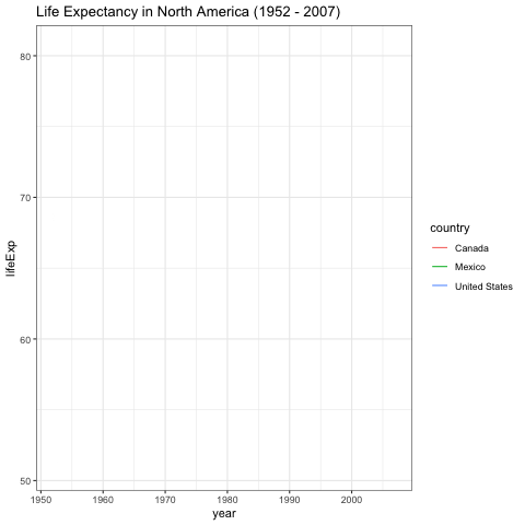
anim_save("graph_3.gif") # to save the graph as gif